
Stop Serving Pie: Why the Easiest Chart Is Often the Worst
- Brian Zrimsek
- Aug 16, 2025
- 2 min read

Pie charts are one of the easiest visuals to create. With just a few clicks in Excel, PowerPoint, or a BI tool, you can turn numbers into a colorful wheel. At first glance, it feels intuitive: a simple way to show one item’s relationship to the whole.

But the moment you move beyond that simple relationship, pie charts start working against your audience.
The Problem with Too Many Slices
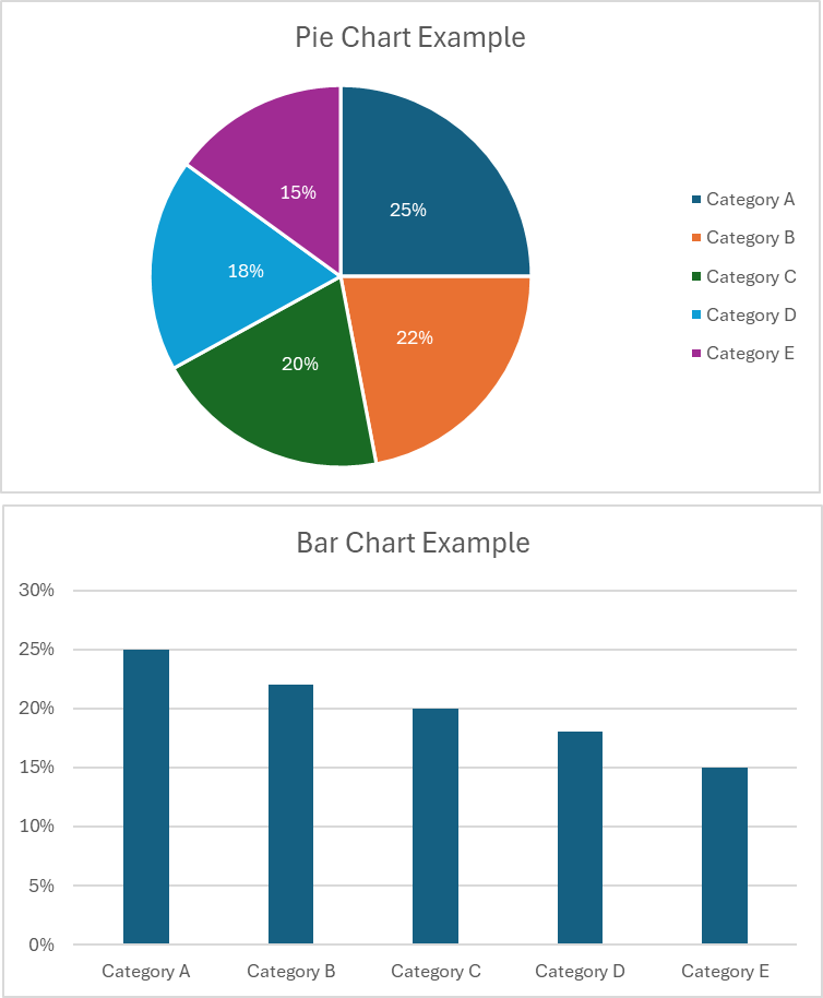
We’ve all seen it: a pie chart overloaded with slices of similar size, paired with a tiny legend tucked off to the side.
To make sense of it, your eyes dart back and forth: slice to legend, legend to slice. Your brain works overtime trying to track which color belongs to which label. The clarity disappears, and the chart becomes a puzzle.

Instead of drawing conclusions, your audience is left decoding the picture. That's the opposite of what good data storytelling should do.
The Real Reason We Avoid Pie
Stephen Few, one of the most respected voices in data visualization, has long argued against pie charts. I leaned on his work heavily when I began building Business Intelligence solutions, and his reasoning is simple: humans are bad at judging areas and angles.
That makes it incredibly hard to see differences between slices, especially when the values are close together.
Bar charts, on the other hand, use what we are good at, comparing lengths.
When the exact same data is shown as bars, differences stand out immediately. The eye moves naturally across the axis, comparisons are precise, and conclusions come much faster.
Why Bar Charts Win
When you choose a visual, you’re choosing a lens for your data. The bar chart is almost always the clearest lens.
Accuracy: Bar charts allow precise comparisons of length. Pie charts rely on rough estimates of angle and area.
Scannability: Bars are faster to interpret, especially when you have more than a handful of categories.
Flexibility: Bars can be sorted, grouped, or stacked, options that are clumsy or just impossible in a pie chart.
Pie charts can still serve a purpose in simple “this versus that” situations or when you want to show a single dominant slice. But as complexity grows, clarity fades.
The Takeaway for Data Storytellers
When you design charts, your job isn't to decorate the data; it's to make meaning clear. Every extra second your audience spends decoding a visual is a second they're not absorbing the story you're trying to tell.
So before you reach for the pie chart button, ask yourself: Am I helping my audience see the story, or am I making them work to find it?
Nine times out of ten, a bar chart will serve you better. Because in the end, your data deserves clarity, not clutter.
You can find links to a few of Few's books in my Storyteller's Library.
-BZ


Comments