
The Scatter Plot: Architecting the Correlation
- Brian Zrimsek
- Apr 13
- 5 min read

The Visual Narrative
Background note: for this piece I'm leveraging a hobby data set about NFL quarterbacks and Super Bowl wins. As a Steeler fan, when Ben Roethlisberger retired, I turned to data to to help ease my anxiety over what comes next. I basically catalogued, for every team, which QB led them in passing back as far as the franchise existed. I then defined a franchise QB as a player who leads a team in passing for 6 or more seasons (6 was chosen to ensure a rookie would earn their second contract). I then did a bunch of analysis, and I'm leveraging some of that here - basically, the relationship between the number of franchise QBs a team has had against the number of Super Bowls the team has won. I get this is not perfect as I'm not (yet) looking through the tighter lens of franchise QBs who won, merely looking at two independent data points and looking for an correlation.
In business, we often fall into the trap of assuming that because two things happen at the same time, one must be causing the other. We see rising maintenance costs and aging buildings and assume the relationship is linear. But "linear" is rarely the whole story. To find the true Signal, you have to move past the averages and look at the distribution.
The Scatter Plot is the ultimate "Insight Hunter." It allows you to plot two separate variables to see if they actually have a functional relationship. It is the best tool for moving an audience from "I think" to "I know."
Here is a sample scatter plot putting Franchise quarterback count against Super Bowl Wins

I may chose to look at three potential outliers: the top left dot, the dot on the Y axis, and the one on the far right.
A few tips to help the insights pop:
The Trend Line (The Signal): Include a subtle, gray trend line. This establishes the Expected Reality—the baseline of what "normal" looks like in your data set.
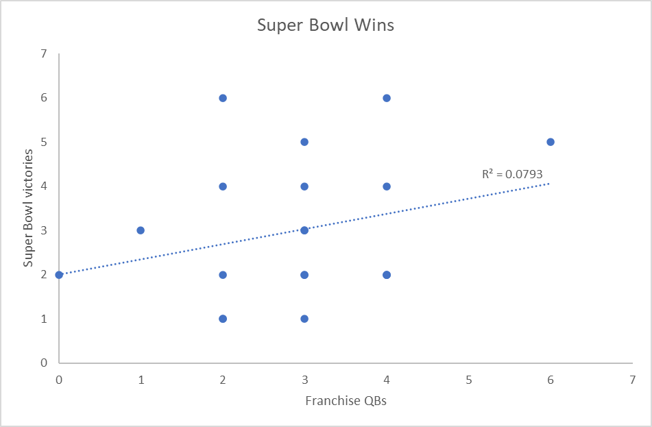
In this data set, the correlation is mathematically weak but does hold up to a common sense test, as franchise QB count rises, Super Bowl wins also rise.
The Quadrant Strategy: Divide the chart into four quadrants with bold, simple labels (e.g., "High Cost / Low Value" vs. "Low Cost / High Value"). This gives the audience an immediate mental map of the Danger Zone and the Gold Mine.
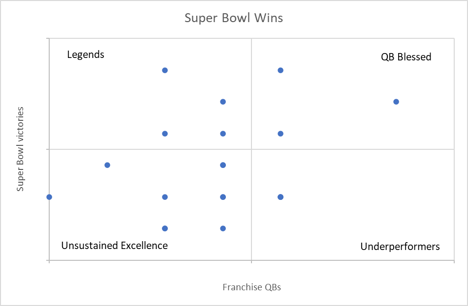
Everyone loves a 2x2 quadrant, something greatly reinforced during my days as a Gartner Analyst.
Weaponize Your Color: Keep 90% of the dots in a neutral gray. Use your brand color (or red) to highlight the key dots that are furthest from the trend line. These are your heroes or your villains.

The one highlighted dot represents my heroes, the Pittsburgh Steelers, with 6 Super Bowls and 2 Franchise QBs :) Two other interesting outliers, the dot on the Y axis represents Tampa Bay with 2 Super Bowl wins and no franchise QBs. The far right dot represents the Dallas Cowboys with 6 franchise QBs in their history and a respectable 5 Super Bowls
Here is the who's who on that scatter plot in case you are interested.

Note that 12 NFL teams have never won a Super Bowl and three of them, Arizona, LA Chargers and Cincinnati have each had 5 franchise, more than any team except Dallas, QBs but they never won the big game. Correlation, not causation.
Modern Tools: The Trend Line Shortcut
We used to avoid scatter plots because the math was intimidating. Calculating a "Line of Best Fit" or an R-squared value felt like a task for the data science team, not the executive suite.
Because of this technical barrier, we settled for bar charts that hid the very correlations we were looking for.
The Excel Shortcut: Scatter plots are native and easy in Excel. To add the trend line, simply right-click any data point and select "Add Trendline." It takes two seconds and provides 100% more clarity for your audience. You don't need to be a statistician to show a clear direction; you just need to know where the button is.
Visual Audit: Clearing the Static
A scatter plot can quickly turn into a "Starfield"—a chaotic mess of dots that causes immediate cognitive overload. If your audience has to squint to find the point, you haven't architected a message; you've just exported a database. To pass the Six-Second Rule, you must curate the view.
Transparency is Key: If you have hundreds of data points, turn the transparency down to 30%. This allows clusters to appear darker, showing you where the density actually lives without the clutter of overlapping dots.
The Direct Label: Don't use a legend. If an outlier is important enough to discuss, it's important enough to name. Label the outlier dots directly with the name of the building or the asset.
Mute the Axes: You don't need a tick mark for every single dollar. Keep the axis labels sparse and clean to ensure the "Architecture" of the chart remains the focus.
The Storytelling Filter: The "Off the Map" Moment
Data without a narrative is just noise. The goal of a scatter plot isn't to show that most of your assets are doing fine; it’s to highlight the ones that aren't. Your story lives in the gap between the expected trend and the actual result. This is the "Off the Map" moment where the Architect becomes the Guide.
The Expected Path: "The gray line shows where our assets should be performing based on their age."
The Anomaly: "But look at these three buildings in the top-left quadrant. They are 'off the map.'"
The So What: "They are costing us 40% more than the portfolio average despite being our newest installs. That is the signal we need to investigate."
The Bottom Line
A scatter plot is the X-ray of your data. It shows the internal structure that a standard bar chart hides. When you architect this visual with clear quadrants and color-coded performance, you stop being a reporter of numbers and start being a strategist of insights.
-BZ
P.S.
One more data point to share. Roughly 73% of Super Bowls have been won by a quarterback for the team that drafted them.

Of the remaining outcomes:
20% have been won by a late career transfer (think Tom Brady in Tampa or Peyton Manning in Denver)
The remaining almost 7% of Super Bowls winners have been early career transfers (while Brees, Favre, S. Young and Theisman became franchise QBs, none were drafted by the teams who they helped raise the Lombardi).
What this means for your favorite NFL team is that drafting a QB is the best path to a Super Bowl, otherwise, pick up a hall of fame ready vet and avoid the retread market.


Comments